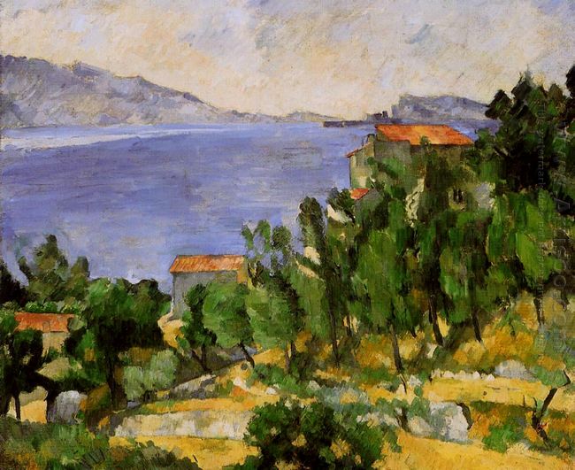
The space of The Bay Of L Estaque is not withdrawn into an infinite perspective like the Renaissance or Baroque style. Buildings in the foreground are gathered together which are close to the viewers. The buildings are simplified into cubes with very bright façade colors on the side. Color shapes which are parallel to the general screen and positive have the same identity, while those vertical color shapes are not, which highlights the buildings. Foreground buildings and trees in front of or behind houses are painted with ochre, yellow, orange and green. When they become smaller and smaller, then they have little difference in the clarity. Although the foreground houses, the roof, chimney and trees and other factors, can be identified very clearly, it is rather difficult to imagine they are the objects existing in the natural space.
If we want to look for space and air around the house and a chimney, we will find empty space does not exist. Tress on the right of foreground house should be farther away from in depth. But in fact, the trees which are performed by mottled colors are right beside the house. Paul Cezanne hopes to use color to recreate the nature. He thinks drawing results in the correct use of colors.
In The Bay Of L Estaque, contour lines are the confluence of tow color blocks. Since these colors have actually changed in brightness or contrast of hue, so their edge is completely defined. However, the specific characteristic tends to connect and unite the color blocks into a whole, which is different from traditional drawing techniques featured by color separation. In the composition of this painting, intuitive understanding of Cezanne's concept of perception is obvious. Seurat once diligently studied this concept in science textbooks. For Cezanne, the important thing is, he found that the eyes are continuously and simultaneously viewing a scene, which gives a painting structure with profound implications.


